- The Growth Recipe
- Posts
- Turn your landing page into a hot persuasion page
There’s a big difference between what is well-designed / looks good and what actually converts well and what turns visitors into leads and then leads into customers.
I've been designing websites for 10+ years (over 500+ websites). This is usually the pattern of a landing page that best converts for SaaS.
A landing page should not explain everything in the fullest detail, but instead, entice them to the next step.
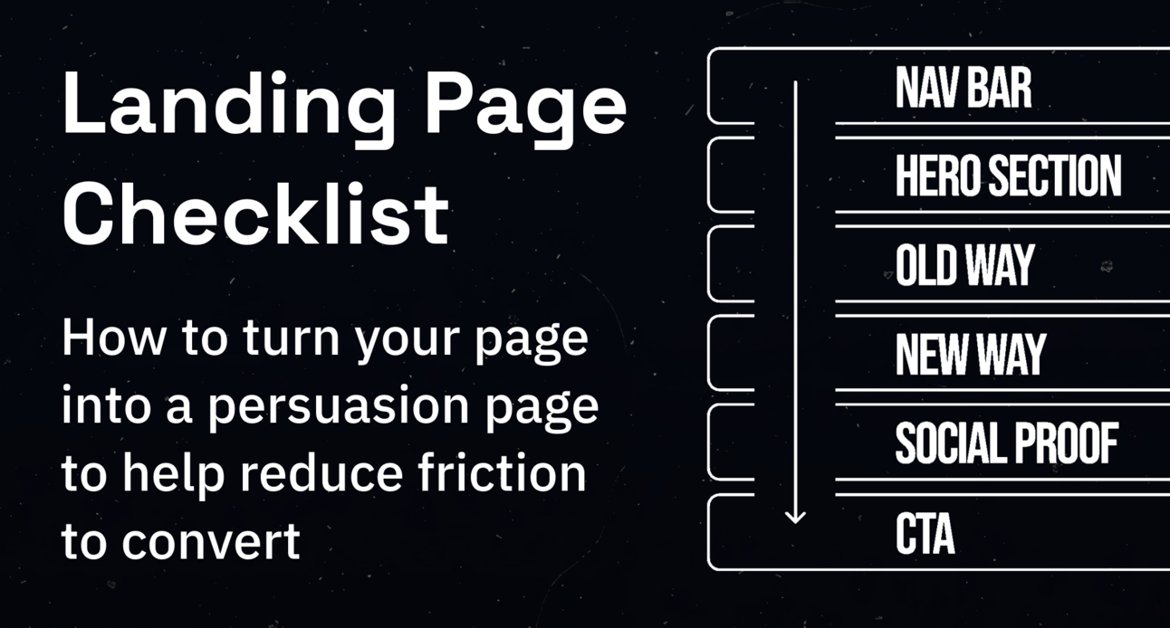
Here's a Saas landing page structure to turn your page into a persuasion page to help reduce friction to convert:
Section 1: Navigation bar
This is the header of the page with links to different pages of your website. The best practice is the fewer the links the better. It makes your primary CTA stand out.
Have only the links that keep them interested. Remove the nav bar for the non-intent audience (interruption marketing campaigns such as Youtube and social ads). You want them to focus on the page and offer solely. Example:
Who for pages (specific personas)
Pricing
Features
Success stories
Resources
CTA button +
Login buttons
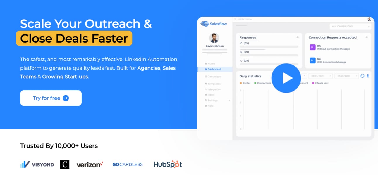
Section 2: Hero section
This is the most important part of the whole page. A lot of thought is needed as this is your first impression.
You have to hook visitors to get them to keep scrolling and keep investigating the offer/ product. Here’s a Hero section framework:
1. Headline: Your boldest claim, the most attractive benefit and who it's for.
The formula for a headline:
How to go from to in with / without «Biggest Pain>
2. Subheadline: Elaborate on the header and tee-up the CTA. The bridge between the primary header text and primary CTA.
3. Creative visual: In the image, gif or video format show and visualise the product that aligns with the headline and subheadline.
4. СТА: Your button with a concise incentive to click to learn more along with logos of well-known customers.
Section 3: Old Way
People are experiencing pain right now hence need your product or service to fix their pain points. When you create your copy, you need to highlight some kind of challenge, the old way of doing things. Do this by:
Agitate pains
Surface problems with the current state
Show the consequences of continuing in the old way
Create urgency to fix the problem.
Section 4: New way
This is the meat of your pitch to them. Tease the desired state, and talk about how your features benefit them and how your product solves their problems.
Highlight 3-5 points about:
How your product fixes their problems
Achieves their desired result
Gets the outcomes they want.
Explain and illustrate how each feature benefits them and address any questions or objections proactively.
Section 5: Social Proof
A strong form of social proof builds trust and credibility. It proves the cause-effect relationship between your solution and the customer's positive outcome. Examples can be:
Reviews
Testimonials
Case Studies
Without evidence, the market is less likely to believe your claims and the lower the lead to opportunity will be.
Section 6: Primary & SecondaryCTA
The CTA should be clear, easy to understand, and not overcomplicated. Providing a "what's in it for me" element that entices them to act. There are 2 types of CTAs:
Primary: Talk about the next steps - Demo or Trial. Address objections and risk reversals:
Freebies
Guarantees
Migration services
Customer support access
Help docs
Show how many people who have signed up in the last week etc.)
Secondary: The vast majority won't respond to your primary CTA. Pitch a lower commitment offer such as:
Ebook/Guides
Video Sales Letter
Tools
Community Access
Webinar
BONUS: Exit intent pop-ups
The key for CTAs is adding value, insight and information to prospects free of charge, with no pressure or risk.
Furthermore
The structure of your page is divided into sections. Each section serves a purpose. You need to set a clear visual hierarchy and draw attention to key sections. Guide visitors through the copy allowing them to easily find the info they're looking for.
VITAL BONUSES:
Page speed:
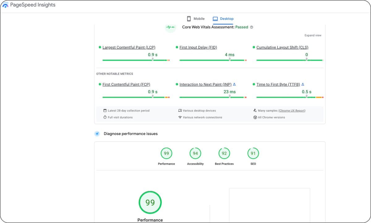
The biggest contributor to conversions is speed. Research has shown that visitors expect a page to load in 3 seconds or less. Otherwise, they get frustrated and bounce. You can have the best page since slice bread but it's not fast, you’re toast.
Get a web developer to create HTML-only landing pages or use Landing page builders like Webflow or Framer as they work like a charm when it comes to web-speed.
Fix the following:
Delete any non-essential code snippets. Put rest on Tag Manager
Convert images to .svg, .png or .webp
3. Compress images (use Optimizilla)
4. Use embedded videos (Vimeo, Wistia)
5. Remove unnecessary text Bonus: Test different landing page builders
Run a speed test on Google Page Speed Insights This reports on the user experience on mobile & desktop.
Providing suggestions on how your page can be improved. Search engines are heavily influenced by site speed; You can get penalised resulting in less organic traffic
Responsive Design
It’s 2023 now, come on, I should not be explaining this. You will be surprised by the number of landing pages that are not fully set up to convert on mobile. Please make your website mobile responsive.
Around 49.5% of your traffic will come from mobile devices. Don't put opportunity at risk by not making your page mobile responsive. How do you optimise it? Simplify the layout:
Single-column layout with minimal clutter.
Make the text smaller
All elements fit the screen
Make buttons large and easy to tap
Reduce spacing between elements
Cross-reference on different mobile devices
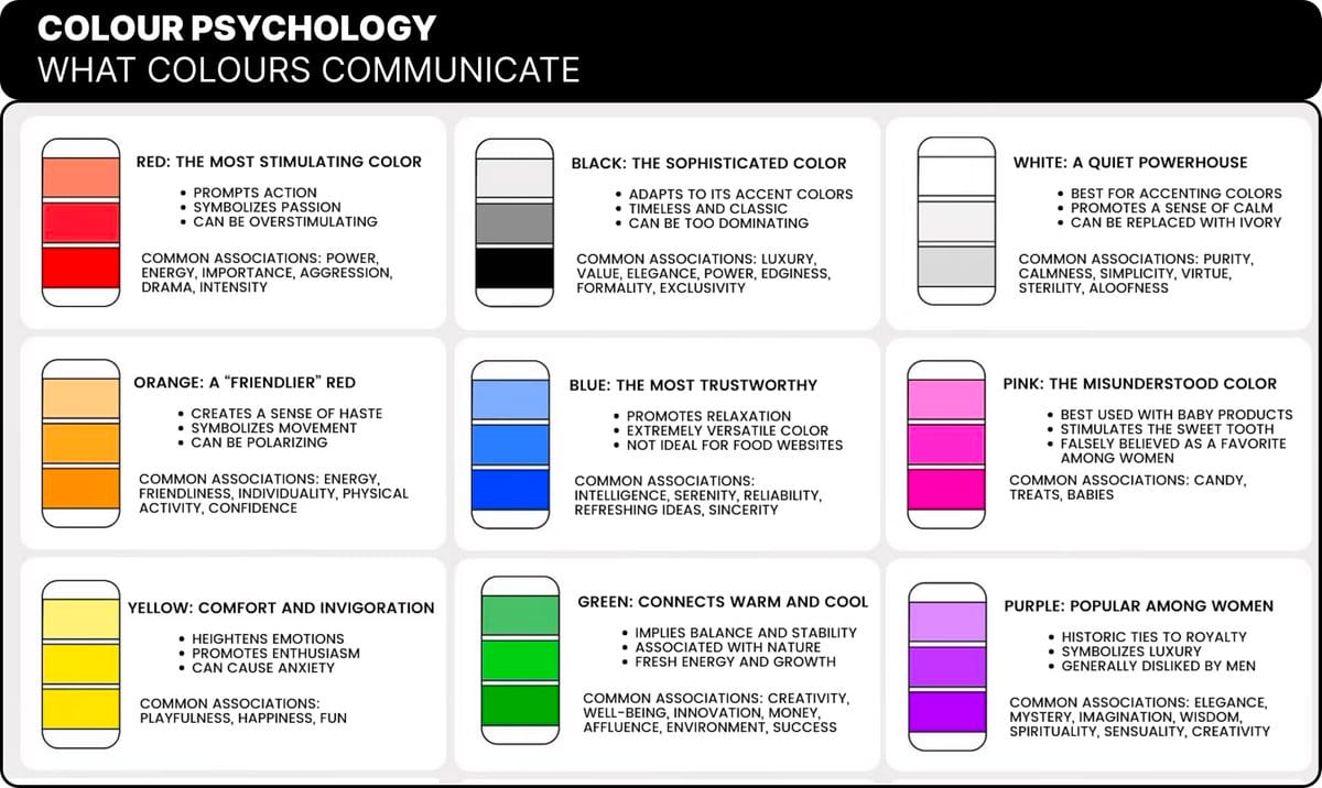
Colours
Colours set the tone / create the overall aesthetic and feeling. Different colours evoke feelings such as trust, friendliness, and energy. Use the colour-psychology map Pick 1 /2 colours that convey the right feelings to your target audience:
Fonts
Fonts determine whether your prospect will read your content or not. Fonts should be easy to read / visually appealing. They create a sense of trust, professionalism, authority and credibility. Use tools like Google fonts to select both the heading and body font.
A little nugget from me:
For body text (paragraphs) Use black text on a white background. It reads a whole lot better than anything else.
Graphics
These break up text and attract the attention of visitors. Graphics like Images, videos and gifs boost conversions.
They can be used to demonstrate your product/service. Providing visual cues that make it easier for them to understand what it is / how to use it.
Well, there you have it.
A concise checklist from all my years in the web design and conversion rate optimisation game.
I believe these are the key for you to achieve success in not just content, but structure and the technical stuff mixed in too.
If you made it here. Thank you.
Speak to you next week,
Rachid